

6-steps to analytical enlightenment
Given their power and utility one might expect that the use of process behavior charts would be as common in industry as calculating the mean. Unfortunately, even with all their stated potential, this is not the case. Thus the 6-step process shown in the block diagram in Figure 1 and outlined below serves as a guide.

Fig 1: Block diagram showing the six steps to build a process behavior chart
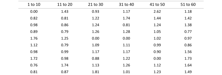
To help facilitate your understanding of this process, the automated manufacturing line data shown in Table 1 will be used as an example. The dataset is composed of 60 logically comparable individual values that were sequentially collected. A copy of the dataset can be downloaded by clicking the DOWNLOAD DATA button below.
Table 1: Automated manufacturing process data
For those inclined to learn how to build a process behavior chart in Excel, click the DOWNLOAD WORKBOOK button below. For those inclined to learn how to build a process behavior chart in PYTHON, click the PBCs & PYTHON button below. This will redirect you to a Kaggle notebook.
“The best analysis is the simplest analysis which gives the needed insight.”
— Donald J. Wheeler, Understanding Variation: The Key to Managing Chaos
Step 1. Gather the data
Aside from the fact that without process data it is impossible to build a process behavior chart, gathering data also serves as an opportunity to understand the process that produces the data. It serves as an opportunity to understand what data is being collected, where the data is being stored, and the format the data takes. This familiarity with the data is quintessential to mapping the values it contains to the real world. It is the difference between understanding a dataset as a collection of numbers on a screen and a collection of numbers that represent physical processes that individuals, teams, and organizations interact with.
In terms of building a process behavior chart composed of individual values and a moving range, called an XmR Chart, gathering data also serves as an opportunity to ensure that the data is organized and structured in a way that it satisfies three requirements: the Association Requirement, the Successive Differences Requirement, and the Moving Ranges Requirement.

Fig 2: The three requirements for a dataset used to build an XmR Chart
The first requirement, the Association Requirement, states that a dataset should be logically structured such that each value can be associated with a unique timestamp or observation. Without this structure it is difficult, if not impossible, to sequentially plot data in a time order sequence.
The second requirement, the Successive Differences Requirement, as articulated by Donald J. Wheeler in his book Reducing Production Costs, states that “successive values [in a data set] need to be logically comparable.” This means that data cannot be used in an XmR Chart that is a mixture of apples and oranges. A data set must be composed of all apples or all oranges. It cannot be a blend of the two.
The third requirement, the Moving Ranges Requirement, as articulated by Donald Wheeler in his book Reducing Production Costs, states that “the moving ranges need to isolate and capture the local, short-term routine variation that is inherent in the process that is generating the data.” This means that your sampling frequency, the rate at which process data is collected, like Goldilocks porridge in the story of the three bears, must not be too much nor too little, but just right.
Step 2. Calculate the moving range
For an XmR Chart, the moving range serves as the within-subgroup measure of dispersion for the individual values that compose the dataset. These values are a measure of the value-to-value variation of the data and are the visual backbone of the Moving Range Chart (mR Chart) portion of the XmR Chart. You calculate the values of the moving range by finding the absolute value of the difference between subsequent values in a dataset. Note the use of the absolute value. The values of the moving range will always be greater than or equal to zero. If in the course of calculating the values of the moving range your result is negative you have forgotten to take the absolute value of the difference.

As an example, let's calculate the first three moving range values for the manufacturing data shown above in Table 1. The first value in Table 1 is 0.00 while the second value is 0.82. This makes the first moving range, 0.82.

The second value in Table 1 is 0.82 while the third value is 0.98. This makes the second moving range 0.16.

The third moving range of 0.09 is the absolute value of the difference between the third value in Table 1, 0.98, and the fourth value, 0.89.

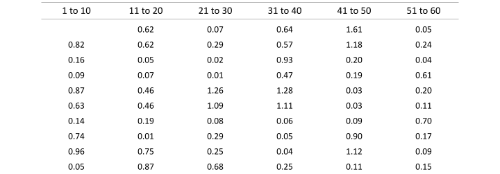
Continuing this process yields the results shown in Table 2.
Table 2: Moving ranges calculated from the individual values shown in Table 1
“Managing a company by means of the monthly report is like trying to drive a car by watching the yellow line in the rear-view mirror.”
— Myron Tribus, As quoted in Understanding Variation: The Key to Managing Chaos
Step 3. Calculate the average moving range
As its name suggests, the average moving range is the average of the moving ranges. This measure of location is a numeric summary that describes the central tendency of the moving range values. It is calculated by summing all of the moving ranges and dividing by the total number of values in the dataset.

The sum of the moving ranges in Table 2 is 26.62. The number of moving ranges in Table 2 is 59, one less than the number of values in the original dataset. The resulting average moving range is 0.44.

Step 4. Calculate the mean
The arithmetic mean or average is a measure of location for a dataset. It serves as a numeric summary that describes a dataset’s center. As was the case with the average moving range, calculating the mean is a relatively simple task. The mean is calculated by summing all of the values in a dataset and dividing this sum by the number of values in the dataset.

The sum of all the values in the dataset shown in Table 1 is 66.07. The number of values in the dataset is 60. Thus, the mean for the manufacturing data shown in Table 1 is 1.11.

Step 5. Calculate the process limits
Acting as a boundary between common causes of routine variation and assignable causes of exceptional variation, process limits are the defining features of process behavior charts. For process behavior charts composed of individual values and a moving range, the three process limits, the Upper Process Limit (UPL), the Lower Process Limit (LPL), and the Upper Range Limit (URL), are calculated using the following formulas:

Here, X-Bar is the mean of the individual values in the dataset, 2.660 and 3.268 are scaling factors, and R-Bar is the average moving range.
The 2.660 scaling factor is required in the formulas for the UPL and LPL to convert the average moving range into the appropriate amount of spread for the individual values. When a dataset consists of logically comparable individual values, the value for this scaling factor will always be 2.660. Like 2.660, the 3.268 scaling factor converts the average moving range into the appropriate amount of spread relative to the moving ranges. For subgroups of size n=2, as is the case when calculating the difference between subsequent values in a dataset composed of individual values, the value of this scaling factor will always be 3.268.
Using the above formulas, the calculated values for the UPL is calculated to be 2.27 and LPL is calculated to be 0.

Note that while the calculated value for the LPL is -0.06, the value that the LPL assumes is 0. This is because it is impossible to make a part that has a negative length. Thus, a value of 0 is returned using a max function. This returns the larger of the two arguments provided to the function.
The URL, using the formula from above, is calculated to be 1.4.

Step 6. Put it all together!
With the requisite statistics in hand, the final step in building an XmR Chart for the manufacturing process data from Table 1 is to put it all together. While this can be achieved using a variety of tools, the tools that are most widely used in business and industry today are spreadsheet software packages like Microsoft Excel and Google Sheets. In service of highlighting that special software is not required to build an XmR Chart, the XmR Chart shown in Figure 3 below was built using Google Sheets. The same figure can be generated with minimal effort using Microsoft Excel.

Fig 3: XmR Chart of manufacturing data created with Google Sheets
The utility of building your own process behavior charts, as opposed to relying on third party software to build them for you, is multifaceted. First, it forces knowledge and familiarity with the process or system that generated the data. Without such knowledge, process data is little more than numbers on a screen with no overt connection to the real world. Second, building your own process behavior charts enables you to more readily make sense of variation. It allows you to check your work and identify mistakes before they become a larger issue. Finally, building your own process behavior charts empowers you to perform analysis and facilitate improvement with no prerequisite for third party software. It allows you to use the most basic and ubiquitous analysis tools (spreadsheet software) to characterize processes and facilitate improvement. This ensures that the time and attention of technical resources are directed to where they are needed most. It ensures that you turn data into insights and insights into actions that result in quantifiable change.